This is the highest-level decision you can make.
Other design details will follow from this one. Like fonts: if you go with a modern bento-box style, you’re probably going to use a geometric sans-serif. If you want your site to look like a beautifully typeset book, you better find a great serif.
Most of the patterns here are meant to be used for the home page of your site. Content pages need to be simpler because they have to work for every essay/post, but the home page is under your direct control and allows for cooler designs.
I’m going to skip past the simple single-column vertical scroll page, because it’s the web default. And it’s a pretty good default too! Works on every kind of device screen, no need to write a single @media screen query if you don’t want to.
Vertical splits
Simple enough (though surprisingly difficult to implement), it’s a step towards a denser layout.
It doesn’t really “work” on phones, because there the columns are usually set to wrap under the previous one in one long column, which is the same thing as having a single column page to start off with.
But who cares about phones?
Sure, more than half your visitors are going to be on mobile devices. But that shouldn’t keep you trapped within the forced minimalism of “modern” layouts.
Horizontal scroll

If you really want to max out the information density of a page, you can’t do much better than a vertical page + horizontal-scrolling sections.
It is the classic “browse, and go deeper when you feel like it” layout.
You can fit in a ton of content like this – the “blog” section could contain the entire history of your writing (not that much, since you never seem to get around to publishing) without wasting vertical space.
Warning! This layout often sucks for people who aren’t using a trackpad or smartphone. You’ll need to add some kind of Javascript-based affordance for them to scroll (clickable arrows, maybe) or inform them that shift + scroll is what they need to try.
Down the middle
This one is surprisingly uncommon, compared to how well it can work for certain types of content (portfolios, multiple sections of writing).

It’s not very different from a sidebar. Just like the sidebar, it can contain the main navigation for your site. But it’s size means that it can hold way more information, including the secondary nav for the current site section, or a table of contents.
Table / grid
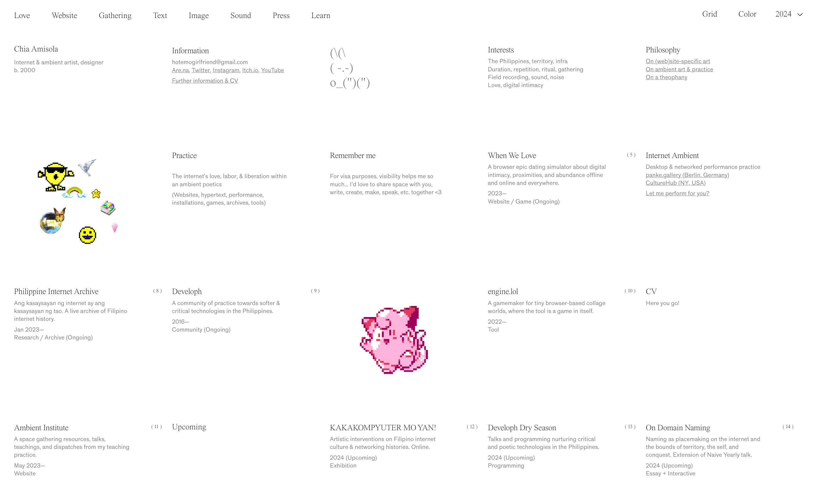
Tables on the web are…tricky. It’s really nice that there’s a defined <table> tag, but there’s also the fact that styling them sometimes isn’t as easy as using a bunch of <div> elements with flex/grid.
The best place to use this layout is for comprehensive indexes, the kind that lay out your whole existence in one, super-dense grid of text.
Make sure they work okay on mobile though, you can choose between making them wrap (for grid/flexbox) or scroll horizontally (proper tables).
For styling, you can play around with border styles, cell colors and padding, fonts, and column-widths. For peak density, try a grid of grids; tables nested within a multi-column layout.
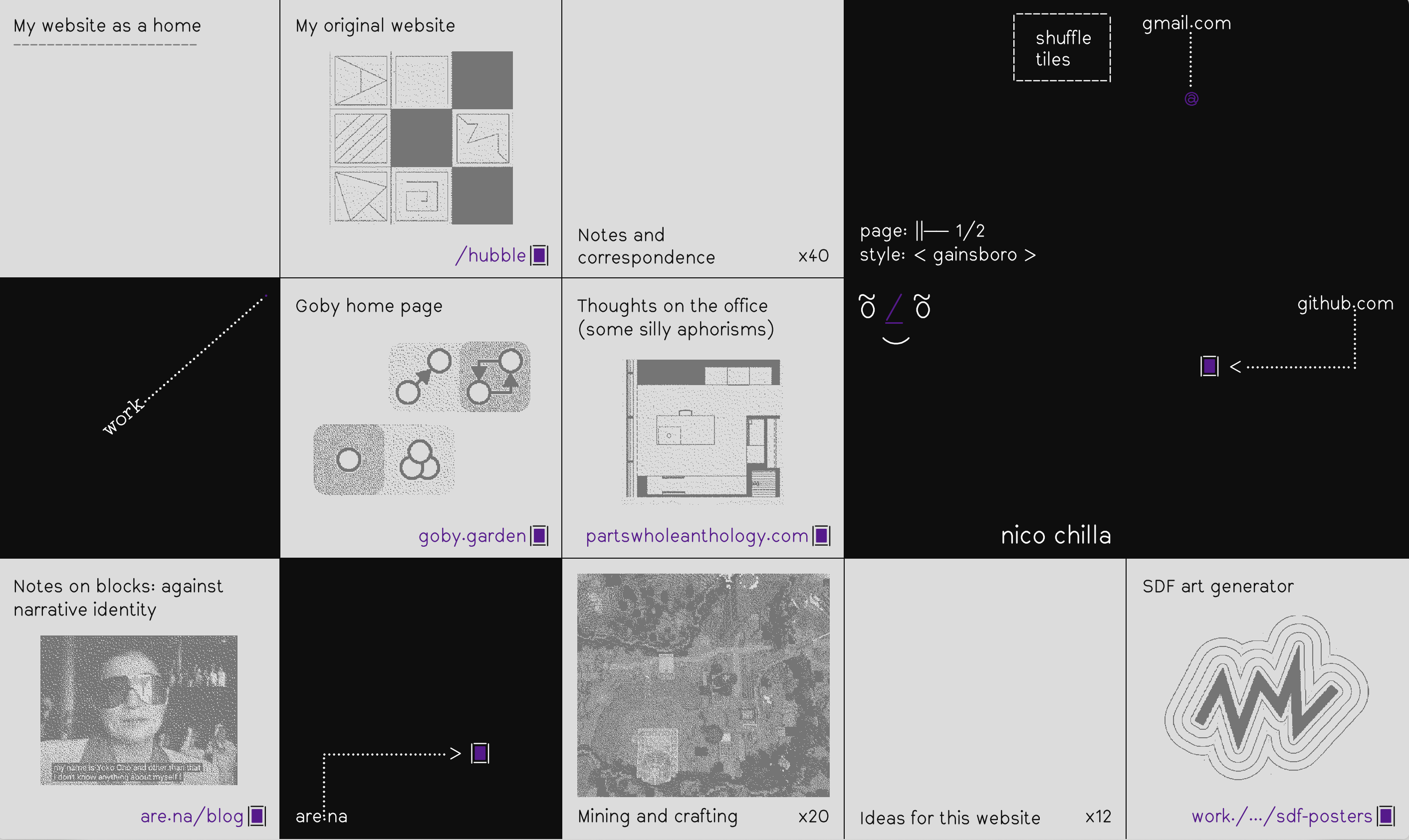
App

As far as I know, Brian seems to be person who did this first (or at least, most famously). And it seems to have found a niche among in the “developer” demographic of website-havers.
Another well-known example comes from Rauno. Each page on his site is almost a different app, and the dock has a volume control button.
Overkill? Maybe. But not as bad (good?) as the people who use literal desktop OS layouts as their entire site. This, I don’t particularly recommend because it breaks a lot of the rules around how a good website should work.
Timeline
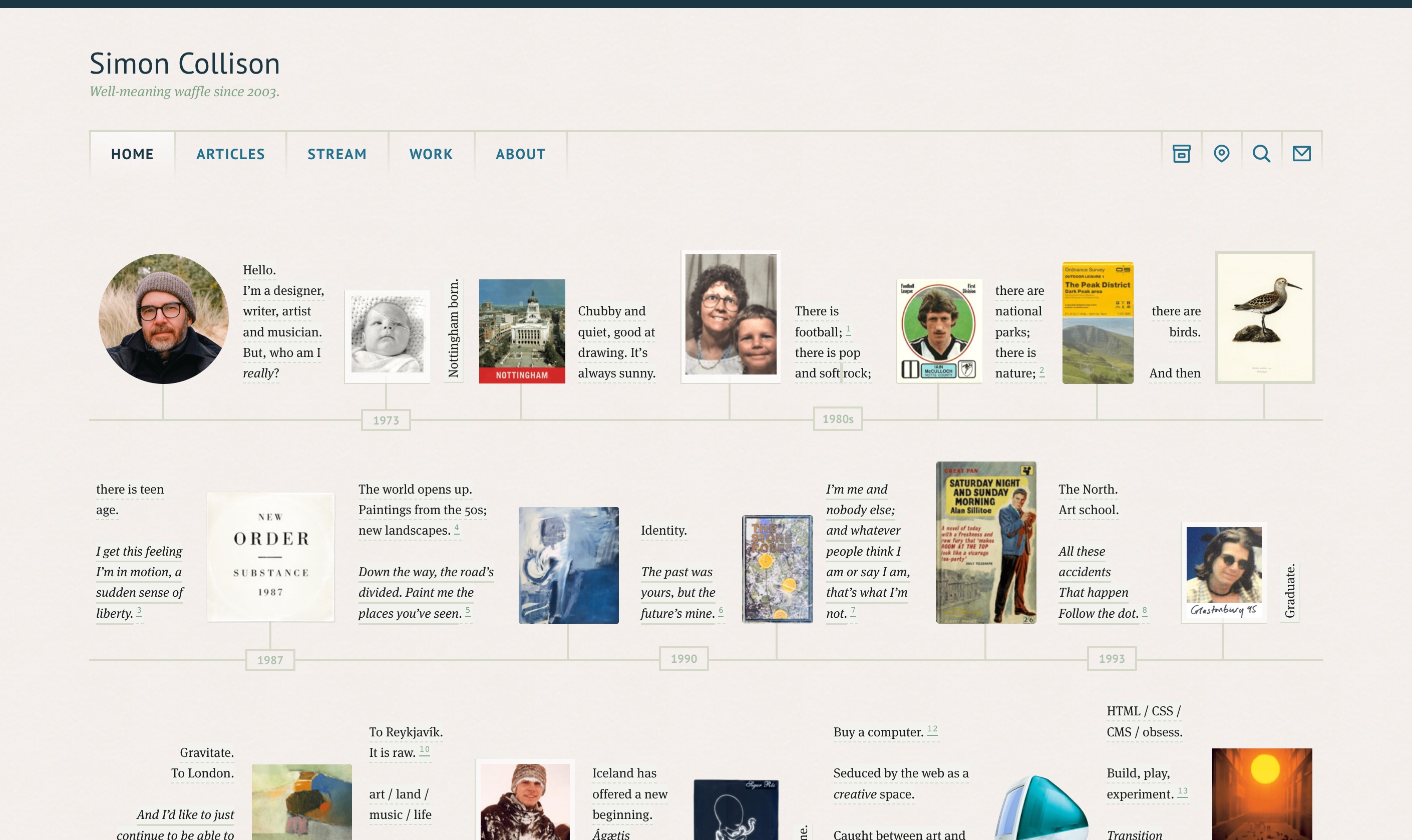
Implementation is an open problem, but the idea of your home page being a timeline of your life will directly affect it’s layout, so I’m counting it as one.
A simple vertical list (with notable events following each other in chronological order) is on the easier side of the scale, and can look pretty good too.
Simon’s site, however, is on the other end of this simplicity scale. It’s intricate, and laid out as multiple horozontal tracks. But it collapses beautifully to smaller screen sizes, really excellent stuff.
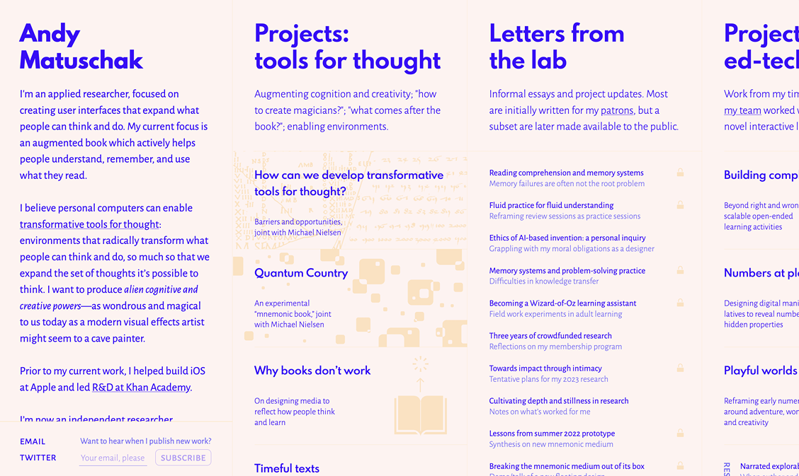
Two/three-column
This is “just” a vertical page, yes. But hardly anybody does multiple columns of text on the web anymore! It’s a shame, beause column-count: 2 makes it so easy.
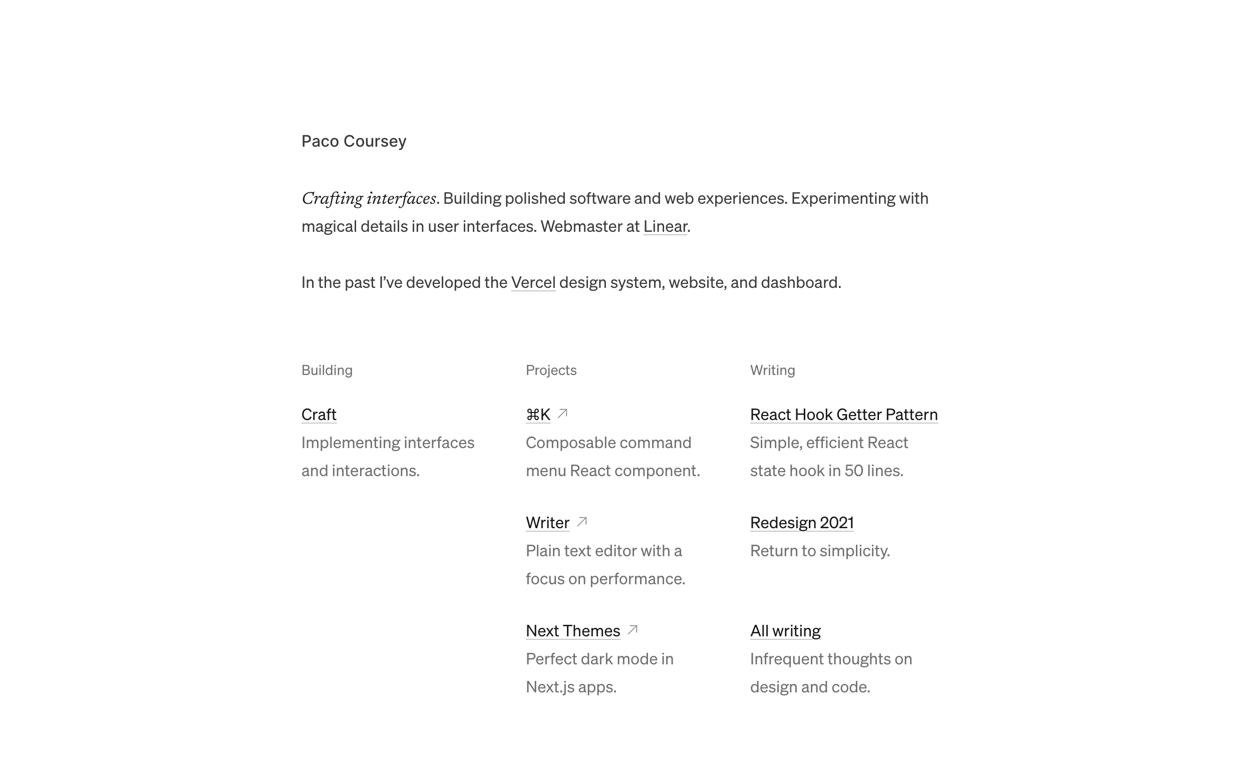
I also count table-style layouts (like Paco’s site here) as multi-column. As long as you hide the cell-border lines, the effect is usually the same.
Webpages descended from literal “typeset-in-books” pages, you’re allowed to lean on those design languages.